MONOPOLY Bingo! is a free online bingo game combine classic MONOPOLY rules with bingo boards and VOILA! In this game , users can play to collect rewards with MULTIPLE bingo cards, tournament, advent calendar and more events.
Why redesign
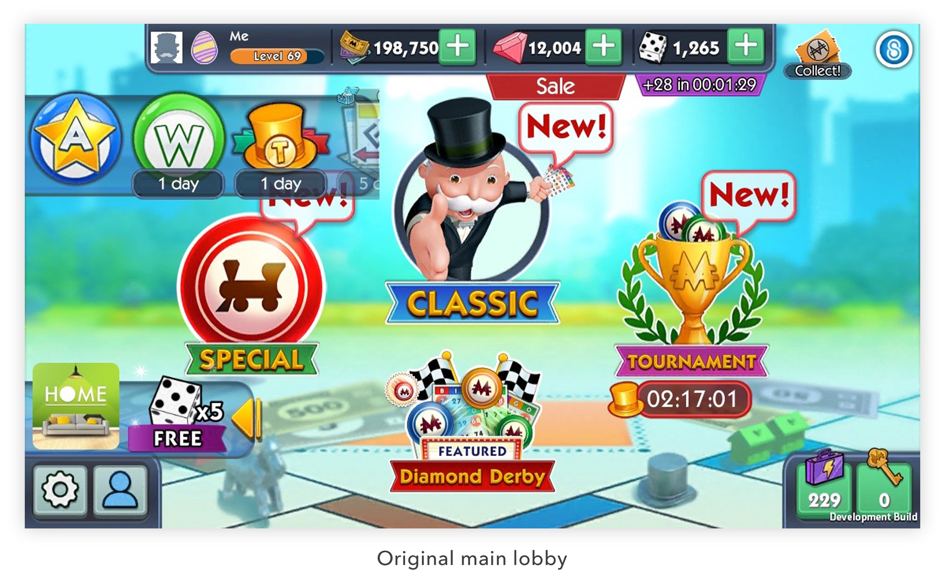
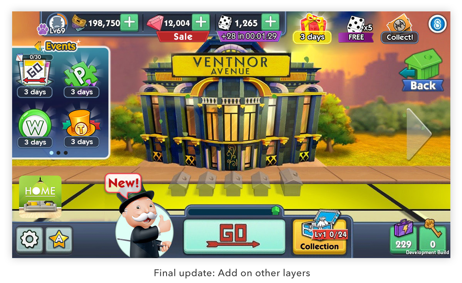
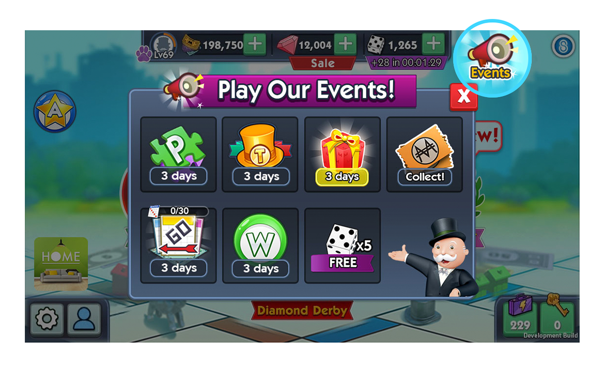
In MONOPOLY Bingo! We surface Classic Bingo, Special Bingo and tournament large buttons in the main lobby. After adding the "Featured new room" which lets users' eye tracking busier. We're also running multiple events and some of them will turn on at the same time like super tournament, words of world and puzzle, etc. We used a quick way to put all events icons in a scroll view tray but it's causing issues: Covering the main buttons, having weird icons cutting and dropping down performance, etc.
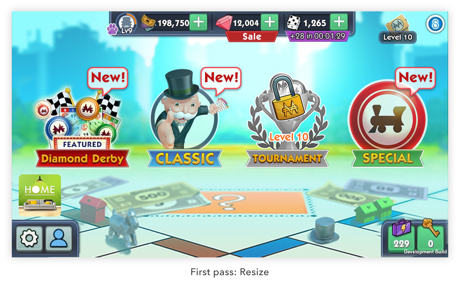
Step 1. Resize the main icons
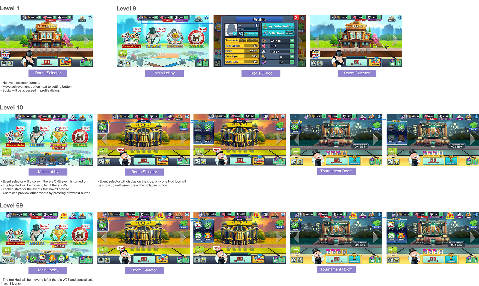
At the first step, I resized the main buttons and line up for to maximize space. If they're symbolic and the most important roles, I put them in the center spot so users can find them really quick.
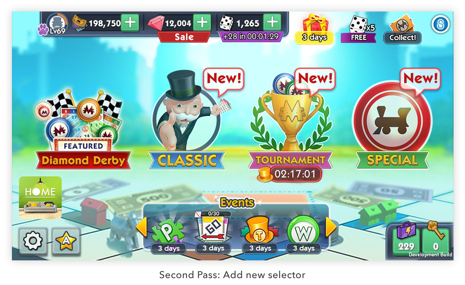
Step 2. Create new event selector
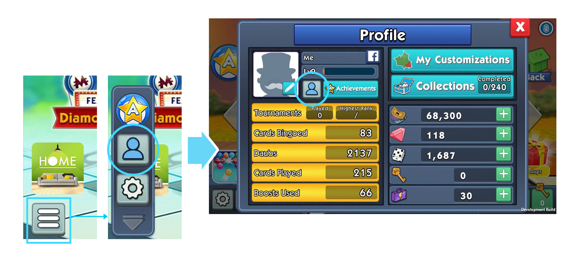
I put a new event selector after several ideas pitching, showing four icons when users explore the events. Base on the main goal for making design hierarchy, I also reorganized top and bottom HUD icons. Moving watch to earn button with bundle sale and scratch because they're regular features. Changing achievement button to be one of the natural basic buttons instead a large button on the left side.
Step 3. Consistency in UI/UX
In MONOPOLY Bingo! After users tap one of the main buttons, users will go to the room selector pages to choose their preferred theme. There's different layouts in the bottom so I need to resolve this case. I designed a collapse arrow button to expand from one to four icons display. I used pagination design to give it flexibility in showing more icons.
User Flow
User Research & Testing
In this redesign project, before I made final update I did the research about user experience issue base on our A/B testing data.
Research 1. Tracking button value
From usability perspective, we prefer to reduce input effort for fields with values that vary little. When I redesigned the bottom buttons grouping, I was working with project manager to analyze button tracking performance. Base on the number we decided to put the social button into the profile dialog since not too many users tap it but we still want to keep social function in this game.
Research 2. A single click for multiple
We were thinking to show one event icon and give user a list dialog to keep the main lobby cleaner. After a testing from the picked users, we found out not too many users tap those buttons. Also, it increases one more step for users to enter the events.

Takeaways & Result
From this project I realized how important it is that users should find it easy and become proficient when using a design interface. They should be able to achieve their goal easily through using that design. Especially Monopoly Bingo!, which is a very colorful game, reducing visual noise and keeping user focus on the high priority goals we offer.
After we publish this update the retention is 8% higher then the previous design, it is a successful significant change from our redesign process.