
Introduction
The goal of the UI design for Eraser Blast is to create a delightful, intuitive, and highly satisfying player experience that emphasizes the tactile joy of erasing. Every interaction—taps, swipes, scrubs, blasts—should feel soft, smooth, and rewarding, with visual feedback that makes players want to keep clearing more levels.
Redesign goals for a better user experience
The goal of the Eraser Blast UI redesign is to transform the game’s interface into a cleaner, more modern, and more satisfying experience that enhances player clarity, engagement, and delight. The redesign aims to refine visual hierarchy, streamline interactions, and strengthen the overall brand identity so the game feels fresh, polished, and emotionally rewarding.
Start from UI/UX Feedback

Tutorials lead UX improvement

Pre-Game design

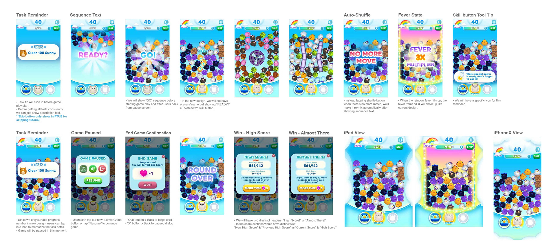
Mini-Gameplay
Additional features influence player engagement


Outsourcing management
My outsourcing management experience combines clear communication, quality control, efficient workflow organization, and strong creative direction, contributing to projects that ship efficiently and meet a high professional standard.

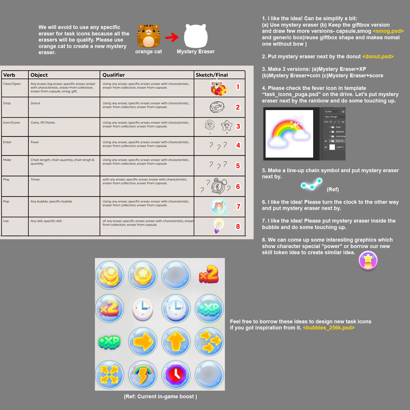


Icon design
I have extensive experience creating clean, polished, and purposeful icon designs across a wide variety of styles, including vector, 2D, fantasy, casual game, and premium UI aesthetics. My work focuses on clarity, recognizability, and strong visual storytelling—ensuring each icon communicates its function instantly while fitting seamlessly into the overall product design.
