Introduction
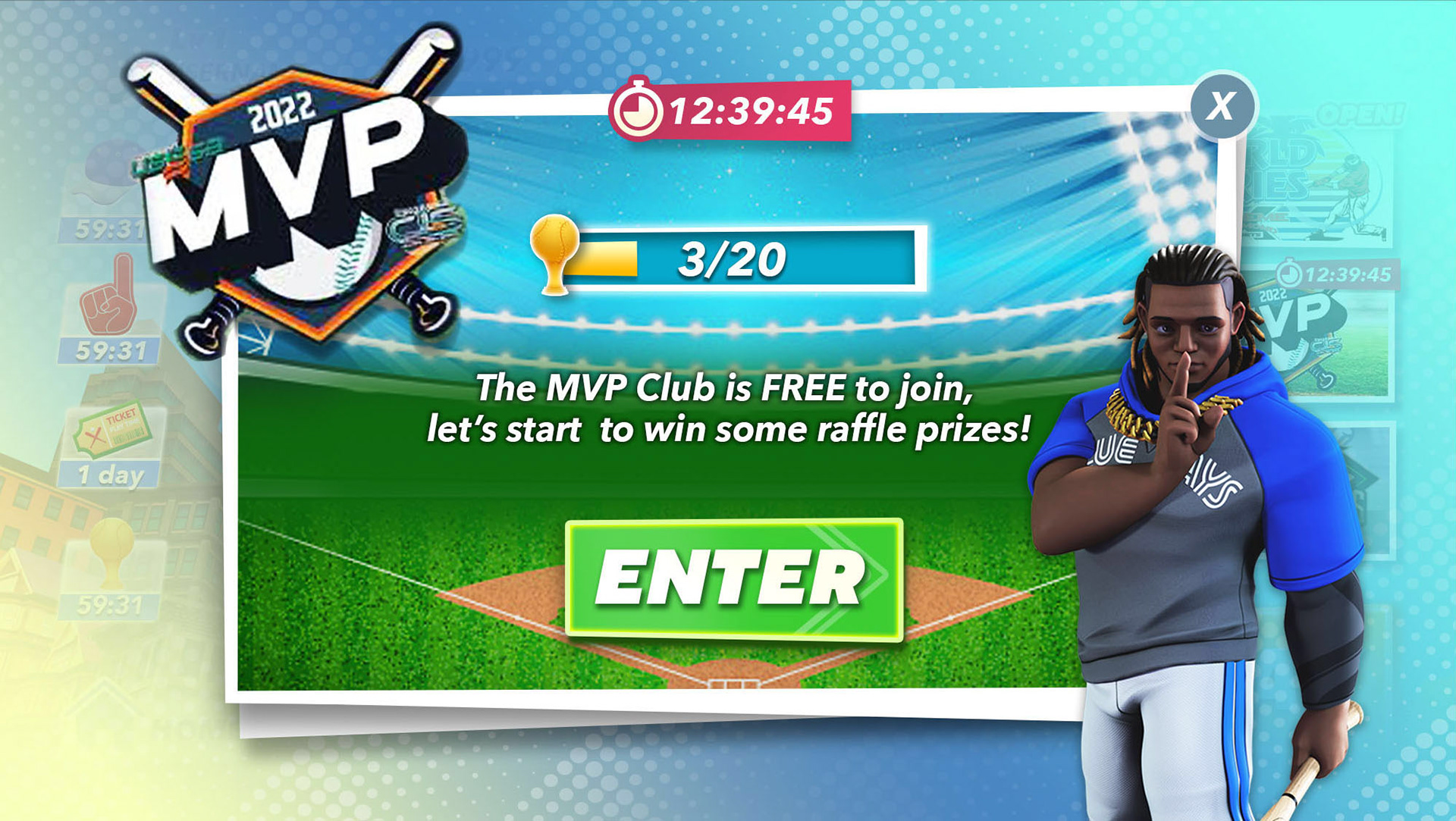
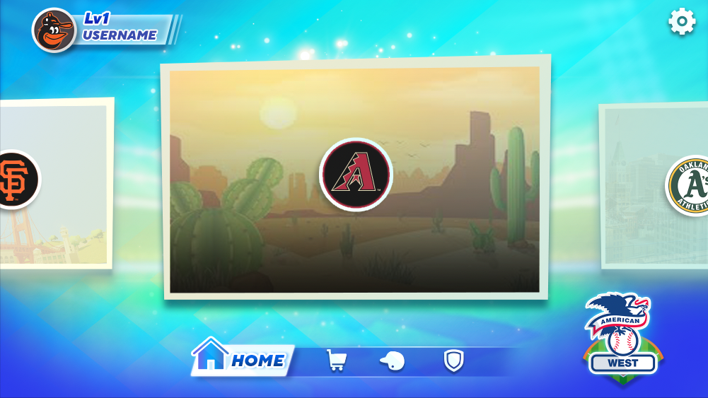
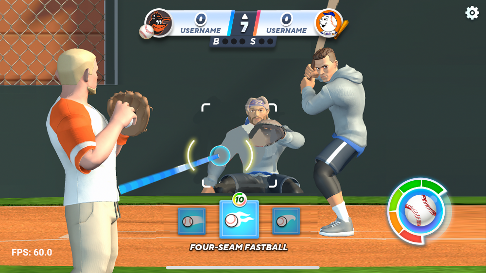
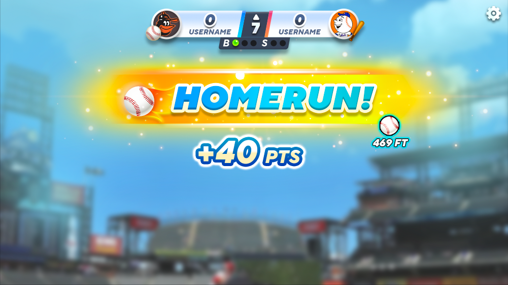
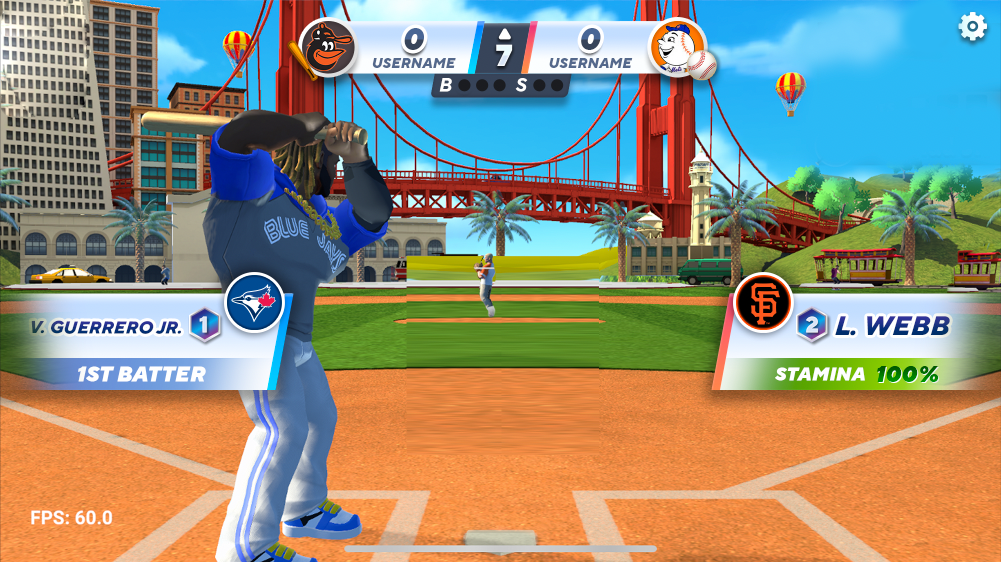
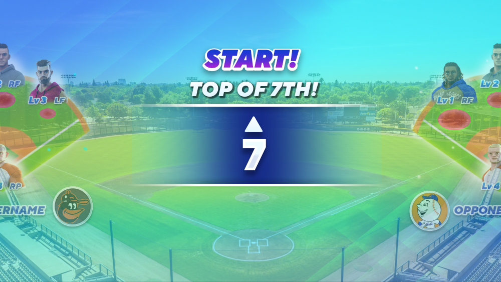
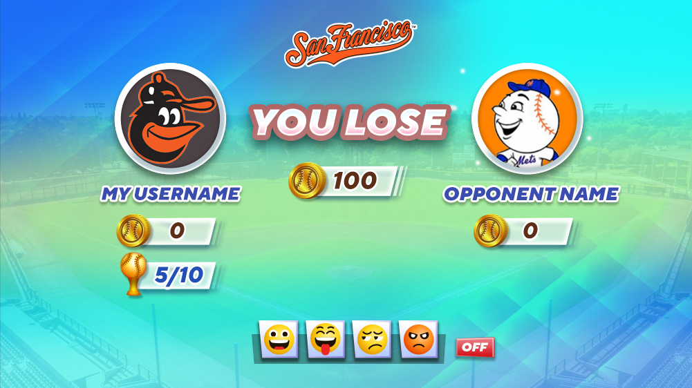
We defined a cohesive visual language for the baseball prototyping, focusing on clean, readable sports UI with energetic colors inspired by stadium scoreboards. Typography, iconography, and button styles were aligned to convey a competitive, fast-paced, and intuitive feel for quick decision-making.
Brainstorming + Main Map + Flow Wireframe
We begin by gathering all creative ideas, themes, visual inspirations, and possible gameplay or feature directions. Nothing is filtered at this stage—every concept is captured to give us a wide vision of possibilities. This helps identify unique opportunities, core mechanics, visual identity, and user emotions we aim to evoke.
The Main Map defines the overall layout and high-level structure of the game or product. It shows how major areas, features, or screens connect to each other. This map acts as the “big picture,” ensuring all components make sense together and establishing a logical world or system flow.
The Flow Wireframe breaks the Main Map into step-by-step user interactions. It visually outlines how users move through the experience—from entry points to actions, decisions, and outcomes. Each screen or state is represented with simple wireframe layouts that focus on functionality and clarity.
Prototyping
Visual Mockups
This set of UI mockups showcases the visual direction, interaction structure, and gameplay clarity for the baseball game experience. The designs focus on delivering a dynamic, sports-driven atmosphere while ensuring smooth, intuitive player actions.

